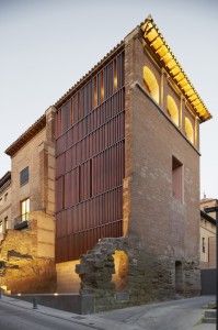
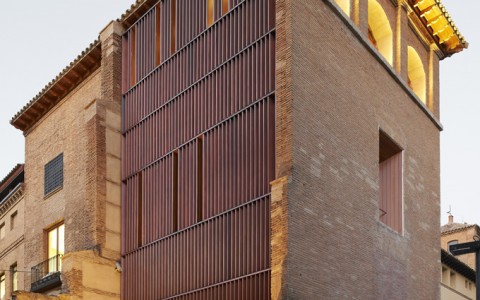
 The Cool Hunter website has some beautiful photos of modern additions and insertions of new buildings and elements into old historic buildings. In all of them, the new is juxtaposed to the old rather than trying to restore the building to an original state, or reuse a traditional or classical architectural vocabulary. This approach is actually supported in the Secretary of Interior standards, where new additions are suppose to be “of the their time” and not give an appearance that they were original when they are not.
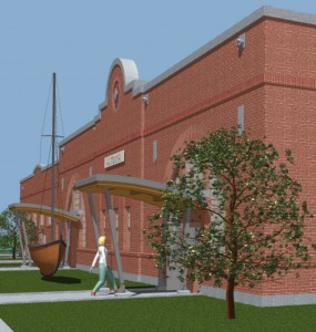
This is the approach I took with adding the entry canopies to the Depot project in Astoria. Taking a cue from the recent addition of the Columbia River Maritime Museums, I used the curved roof form, wood roof structure, and galvanized metal posts to create the entries. This approach also had the benefit of visually tying the Depot to the Museum, which helps overcome the distance between the two buildings. The decision was made easier since I couldn’t find a traditional entry canopy design that lent itself to the task, due to the arrangement of the door inserted into the arched windows. As opposed to the examples above, my solution is easily remedied in the future, since the canopy is self supporting and only attached to the building to stabilize it.
 There is a debate going on with the traditional/classical architecture side of architecture and historic preservation, where they argue against this type of juxtaposition, feeling that there is long standing tradition in classical and traditional architecture of adding to buildings in a less confrontational way. They point out that the current interpretation of Secretary of Interior Standards has favored a modernist style over a traditional or classical style and encouraged this juxtaposition, often in very jarring and less accomplished ways than the examples above. Steven Semes, a leading proponent of this approach, has a book called “Future of the Past” that does a good job of laying out this point of view.
This is also the approach that the Historic Preservation League of Oregon took when developing its guidelines for Compatible Infill Design for historic districts. They stepped back and said that in historic districts it is the district itself that is the resource and that this type of juxtaposition, while it may be interesting architecturally, detracts from the overall character of the district. I agree with this point of view and of the images, the least convincing is where a modern building wraps around an historic village. For the others, it is not mentioned if they are in historic districts or not.
In the meantime, enjoy the photos and make up your own mind about these projects and what approach you think is appropriate. I tend towards towards a more traditional approach, but feel there is a place for juxtaposition as well.

